Stockton Unified School District - Department of Public Safety Rebrand:
2020-2022
From 2020-2022 I Art Directed and developed a new identity system for the SUSD - Department of Public Safety. The rebrand included logos for the Police, Campus Security, and the Youth Advisory Board.
The rebranding of the SUSD Department of Public Safety started with the goal of a perspective change. To achieve this, we felt we needed to simplify and modernize the look and feel. We had to mark a change in the old and celebrate a new chapter.
Before starting any design variations, we explored the history of SUSD and past design decisions. What we found while searching the archives at The Haggin Museum was inspiring. In the past there was so much craft put into the design of collateral for the district. From old sports event tickets and old yearbooks, we were able to take visual inspiration and create a new look that is modern, inviting, and clean.
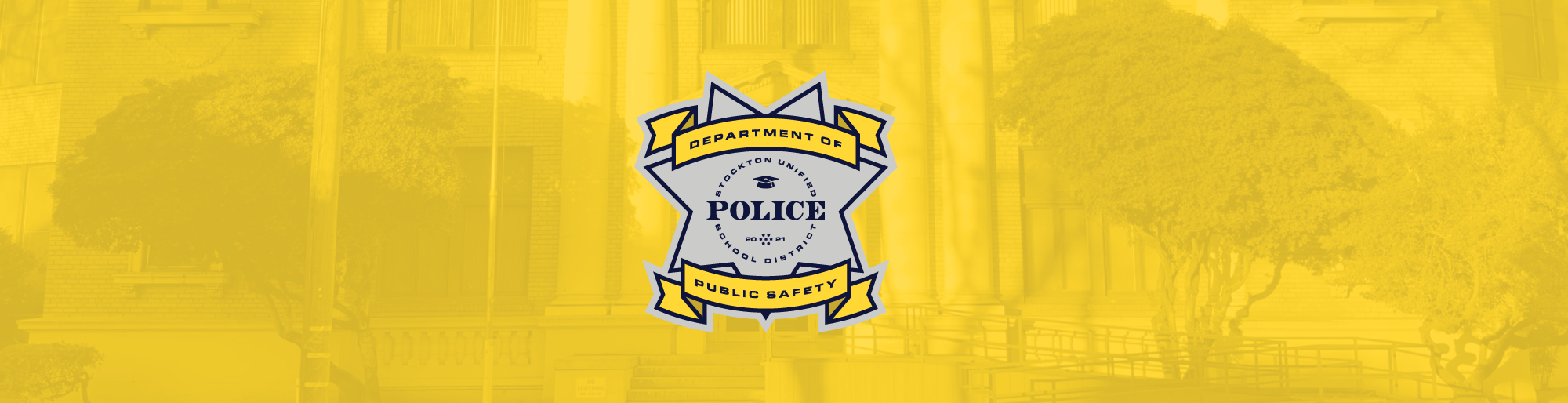
The final design system includes one main logo and two secondary logos. All of them showcase the year 2021 to mark the start of our new direction. The main logo is simple and bold. It was inspired by old badge designs and features a graduation cap to show our ultimate goal of getting students to graduate. It also features a seven starred hexagon pattern that symbolizes all the areas in our district.
The Youth Advisory Board logo was inspired by old designs used at Stockton High. We wanted to show our commitment for knowledge, wisdom, and liberty with the torch in the center of the first alternative logo. The “S” in the center of both logos represent Stockton and the rays from behind it represent growth and illumination. The “S” with the bear in it represents our state of California.
Initial Logo & Brand Explorations
6 directions:
Star/Badge Design
Stockton Contour Design
Liberty Bell & Californian Golden Bear system
Circle Design
Grey Heron Design
“S” & Liberty Torch
We wanted to explore a couple different directions before selecting the final identity system. We developed 6 different approaches and used one color palette across all of them. In the end we mixed and matched elements across all 6 variations and made one family of assets.
Final Identity System


Business Collateral Design

